DISTRIBPIX
“Naked Came The Box Art”: The Anatomy of a DVD Box Cover
This is an account of the creation of the box art for our new DVD release of Radley Metzger’s 1975 classic, “Naked Came The Stranger”.
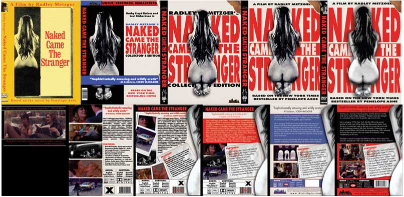
From concept to completion, I will take you on a tour through the many versions of the box cover along with explanations of what we were trying to do at each step. This was a weeks-long process including dozens of hours of collaborative screen-sharing over Skype. Over the course of the design process, we created many complete drafts and made hundreds of changes. Some were ‘no brainers’, others were made with resistance. But in the end, it was an incredibly communal process in which many friends, colleagues and artists were involved. Everyone left their ego at the door and collaborated in a way that exemplified ‘team work’.
It is important to keep in mind that the goal of this box cover art was to bring together and represent many aspects of this historic film. The film was based on a NY Times bestselling novel from 1969. The book and original film release featured an iconic erotic image. The story had a scandalous reputation, both in its content in the story of its creation. We wanted to incorporate these elements and keep the feel of a sultry late-60s hardcover but also modernize the look and feel to convey that this is an all-new, deluxe, remastered DVD. I guess we wanted a product with mainstream appeal, eye-popping design, and plenty of sexual allure.
The design process started during my initial attempt to collect images and text relevant to the film- from scanning old sell sheets to finding quotes from newspapers. I used a standard Photoshop template and began to lay out some images, coming up with a rather elementary design just to get the wheels turning. I shared the design with my colleague, Ian Culmell, who is responsible, along with myself, for the full concept and layout. Fortunately, we also had some support from a very talented dynamic duo of creativity– more on that in a bit.
So here is what I had come up with at the beginning:
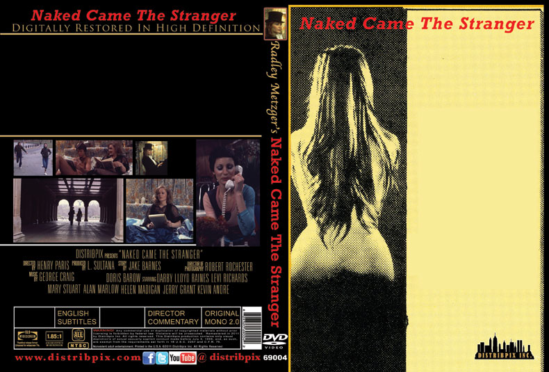
Then I let Ian Culmell take the helm, while I aggressively fed the fire of creation from the co-pilot seat. We spent some hours burning up the keys on SKYPE with a hard session of Photoshop work, ping-ponging ideas which took us in an entirely different direction, but which felt good. The idea for the front initially featured a much smaller image but once it hit my eye, I saw a vision of a novel from the shelves of any airport book store or even a Barnes and Noble. It just had appeal, erotic appeal, like a mainstream potboiler from the 70s. We knew we had something, we felt very good. We enlarged the design, added a torn corner to reveal the hardcover beneath, and arrived at our basic layout:


The next significant change, seen above, was taking the image from the front of Version 3 and enlarging and extending it to the edges, giving it a more professional look. We also began to balance out the spine. Perhaps the most important change involved the nude at the center of the layout. Initially (through Version 3), it was a photograph cut out from the film’s original Catalyst Productions sell-sheet.
I wasn’t happy with the quality of the sell-sheet’s reproduction of the photo. We wanted to replace it with something original, created from scratch, but based on the film’s iconic image. So I thought it was a perfect time to reach out to a colleague of mine: a guy name Robin Bougie, who has dedicated himself to his craft.
Robin owns and operates Cinema Sewer and also creates high-level customized art for DVD releasing companies. I have followed his art and I am a fan of his comics, his style/design, and his clever writing. If you are a fan of golden-age porn, Exploitation, B-movies or even Hollywood blockbusters, you should pick up a volume of the Cinema Sewer book or magazine. They are chock-full of interviews, incredibly entertaining comic creations, movie references, and information you never knew existed. Pick one up– you will be addicted.
Anyway, he is super talented and when I called him and we spoke for a while, I knew he would be perfect for this task. He went ahead and began to design a brand new, modern interpretation of the nude image- a clean and defined image we could digitize and incorporate into our new layout. And for the record, I found out afterward that much of the work was done by his very talented wife. Here are some of the versions, which were created from scratch:
Ian made a couple of minor tweaks and dropped the resulting image into the design (see Version 4).
With the new nude incorporated into the front cover, we turned our efforts to the back cover (BELOW). We wanted the back to resemble a novel as well, but wanted to include elements that would relate to the film. Hence the inclusion of the cocktail napkin (there is a wonderful costumed cocktail-party in the film). We also needed more room for a proper synoposis and for the technical information, UPC, and company logo at the bottom. The back cover went through a longer evolution with many subtle changes:
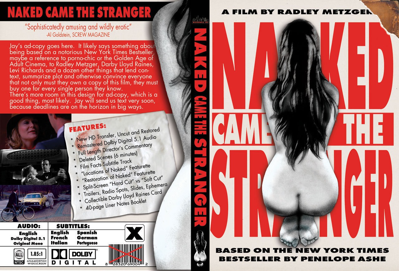
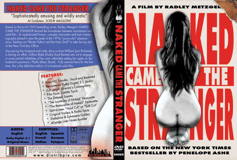


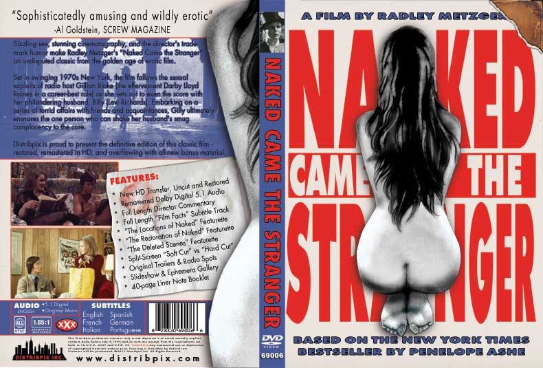
At this point, we were very close to the final version, but the blue background wasn’t sitting right with us. So we brought back the black, white and red, applying the revised color scheme to the back and front covers. This eventually brought us to the final version, seen below.

We are all very happy with the cover (which will also appear on an embossed O-Card!). Its creation was a long, hard and exciting journey, and I look forward to the next one!

